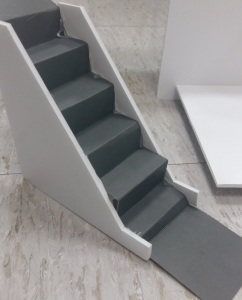
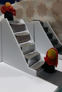
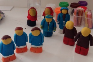
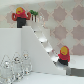
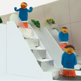
I worked on further improving the photographs. So, I first made a set made of 2 floors and I placed an escalator and a few plants to make it feel as if it is a mall or some actual indoor setting with an escalator. I had to remake the clay figures because the older ones broke or cracked as the coloured clay was not as strong as modelling clay. By adding water, I could repair it to some extent but it was better to start over.
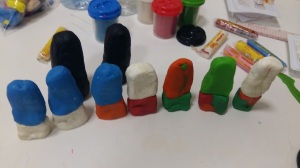
I feel like I have almost mastered the art of sculpting with clay through this project. I think my people have improved a lot but the head is still a bit stubborn to stick to the rest of the body.
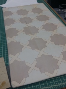
I also made patterns for the side wall on illustrator and tiled them so as to be able to cover the whole wall. Tiling is another talent that I have improved in through different projects. I still remember my first poster I tiled for the poster project for M&P was so flimsy and I was so embarrassed by the bad job I had done but I didn’t have time to remake it. This time however, I think it looked pretty good.

For the local, I made 2 girls in abaya, included palm trees and lanterns and an islamic pattern for the wall so as to give a local feeling. This sign is persuasive as its purpose is to persuade people to use escalators and also a little bit poetic due to the playful nature.
For the concrete, I included 2 escalators as they are usually found in pairs, (one to go up and one to go down). I also included 3 people instead of 2 so as to show the transition of emotions. I used common plants and trees instead of palm trees. I changed the wall pattern to squares as this is a more simpler and global pattern. This sign is also persuasive and poetic.
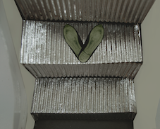
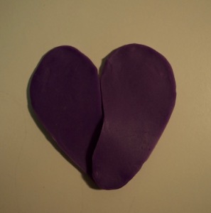
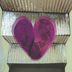
For the abstract, I took a closeup shot of the escalator and scanned my shoe and overlapped it so that when they are on top of each other they look like a heart. The idea was to convey that the escalators are okay and that there is nothing to worry about. This sign is more poetic but includes a bit of persuasive characteristic.
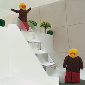
For the global, I used the same wall pattern used in concrete. Here, I used only one escalator and included 2 people in simple coloured clothes and bald as I wanted to make the gender and age as vague as possible as it is meant to connect with children and also grown ups who are still terrified of escalators. This sign is mostly persuasive and poetic.
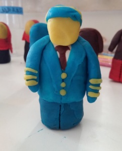
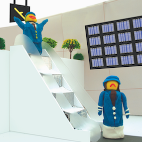
For the vernacular, I made a pilot and a flight attendant also going through different emotions from sad to overjoyed. I also included a sign, a set of TV’s that shows the planes and information related. This sign is mostly persuasive and a little bit poetic as well.
Critique
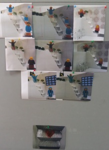
The critique session was very beneficial as usual. First of all, it really helped understand the lighting because I was not aware that the lighting in my photographs were so dark on the laptop screen. Seeing them printed out on the wall next to the others made me realise that I need to play around with the curves and levels and adjust the lighting.
I also got feedback for my abstract sign as I was not happy with it especially since the heart was not looking very much like a heart. Since I couldn’t find a wider pair of shoes, I made shoe soles with clay on which I overlaid the texture I got when I placed sandals dipped in black ink on a white paper. I also changed the color and size and this made the heart more clear.
I was debating whether or not to include an outline around the signs as seen on most signs to make the signs pop out more. However, it didn’t seem to go well with my signs so I left them as it is.
